SOKYO: ENOUGH ROPE FOR PAUL KELLY DESIGN
 Paul Kelly, Director of Paul Kelly Design, talks venue through his design of Sokyo.
Sokyo is a modern Japanese restaurant and the original design brief from Echo management was ‘Modern Tokyo with a Wild Edge’.
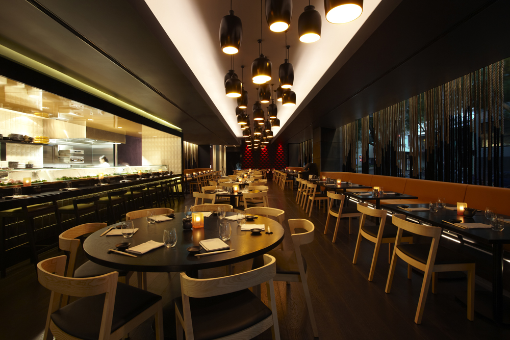
So you’ll find dynamic design/sharp lines combined with representations of Japanese landscape — something which totally infuses the Japanese culture.
A big part of the representation of the earthy, Japanese culture is taken care of by the ropes. We have 7km of ropes in the fitout. It’s not easy to find black rope that isn’t nylon, but eventually we found a little supplier in the back blocks of Delhi. They dipped the ropes in ink by hand, in the traditional Japanese style. The different lengths represent the outline of the landscape. There are around 3000 individual lengths of rope in the sunken function space, and the installation (done by Diemme) was made even more nerve-wracking because the ropes didn’t want to hang straight — the Diemme guys were hanging off ladders trying to steam the rope lengths straight! These are the risks you take working with natural products.
Obviously the edgy Manga-style graphics above the bar (see below) and in the private dining represent modern Japan. We found the original graphic on the web, then had the small dolls they’re based on re-photographed. So, above the bar, for example, is a high-resolution photo that’s around 13m long.
This is a house restaurant for The Darling and we don’t have any million dollar views. So I wanted each space to have its own visual interest and excitement. The main dining area’s focus is squarely on the huge kitchen portal. The head chef Chase Kojima is a culinary superstar and the kitchen is his stage.
We have a massive island bar that feeds off the lobby of the hotel. There are white ‘crocodile’ tiles on the bar front that are uplit. The lighting from the floor as people move about helps provide interest throughout, there’s constant movement.
The pendants were custom made by Diemme (pictured right). It’s a sake bottle concept. We gave the bottles to Diemme which actually moulded and slipcast them. We had a few problems with the control and dimming of the low-voltage LED energy savers. The night before opening, the Dynalite system wasn’t talking to our $100,000 feature lighting — the restaurant was as bright as a supermarket — until I ran to Coles and bought a 75-cent bulb, and popped it into one of the pendant fittings. Hey presto, we were able to control/dim.
The private dining room is hugely popular. The secret to private dining is to have enough circulation space, waiters’ stations that allow staff to dote on the diners, and not too much privacy — there needs to be some voyeurism. Sokyo’s space ticks all these boxes.
The dining chairs were very carefully selected (‘Poltrone Drive’ from Hub Furniture); they set the tone — this isn’t high-end destination dining; you’re allowed to have some fun.
