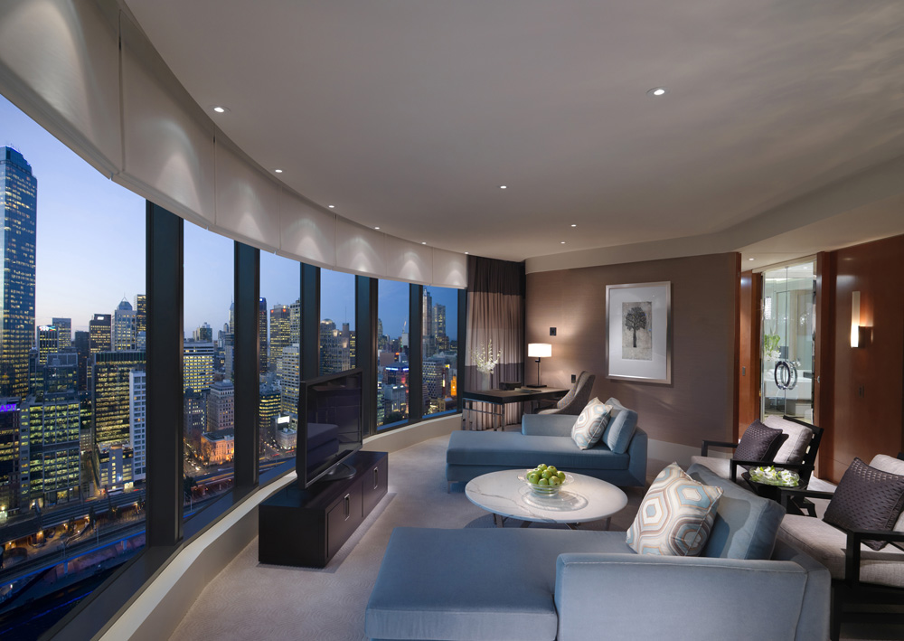
HOTEL LIGHTING DESIGN
 2B Designed Director, David Bird, first began architectural lighting design 23 years ago. He’s watched it grow in style and sophistication. He is now a leading Australian designer with vast experience in hotel lighting.
When I started in this industry 20-odd years ago, there seemed to be very little demand for lighting design in Australia’s architectural community and there were very few of us around. These days, architects and interior designers, as well as a number of end users, appreciate what it is that we do and how our input creates much better results, which is why you’ll now see a lighting designer on all major projects.
WHAT’S ‘IN’ THESE DAYS
The current trend in hotel lighting — much like most of the industry — is energy efficiency. Efficient fittings, efficient lamps and low maintenance. The Crown Promenade recently upgraded one of their corridors to retrofit MR16 LED lamps as a trial. From reports, it is proving successful and this may well be extended to all floors. I have seen this constant desire to save energy even as far back as 2003 at the Le Touessrok Resort in Mauritius. Compact fluorescent lamps are used on the bedside tables and floor lamps wherever possible. The MR16 halogen light sources are very much in decline. Hotels large and small are under constant pressure to keep energy costs down. Pleasingly, we are starting to see more contrast; more light and shade in hotel room lighting. This has happened partly due to the demands of the new energy codes, but also as more theatre lighting designers make the jump into the architectural world. This has given hotels more mood and more drama and as a result, made them more exciting places to be. This is especially true in 5-star and 6-star hotels, where there is a desire for the rooms and public areas to feel more luxurious than their rivals and lighting can play a big part in this.
WHAT WORKS: TEAM EFFORT
Good design demands input from the whole design team. The lighting designer must fully understand the interior finishes and the operator’s needs before the design can commence. Collaboration is the key! Unless you know the interior surfaces and finishes of the room and all the furniture layout, you can’t light it properly. Until you know what surfaces you have to work with, you can’t make a start. It’s all about constantly interacting with the other designers of the space, to get the right outcome. The aim is to enhance the interior design, not distract from it, and you don’t want to add lighting just for the sake of it. I always try to get the visual aesthetic first, then work out how to light it. Too many inexperienced designers like to pick out a particular fitting(s) and look for ways to use it; regardless of its relevance to the space. Lighting design is normally unique to a project or room and is rarely the same as another project. Therefore, how it interacts with the interior design elements is not easy to predict accurately and so the need for mock-ups is critical to a good outcome.
WHAT DOESN’T WORK: WHITE FROM WRONG
I learn more from poorly lit spaces than well lit ones, and it helps to look at other people’s mistakes. One of the most common errors I see today is the ‘White Fruit Salad’ effect that can come from using different colour ‘white’ light sources. This has been exacerbated by the rapid rise in the number of LED fittings on the market, where it stands out like a sore thumb. While getting the right colour balance is difficult, it’s vitally important to the success of a space.
THE BALANCE
One of the keys to hotel room lighting is getting the right balance between task light and decorative light. It’s easy to get it wrong, and most inexperienced designers put more lighting in than they should. Most commonly, there is a tendency to put in too many downlights. Look at the architecture, create emphasis of the features, light the tasks, and that is all you really need. Many designers and clients ask me ‘but won’t it be dark in some areas?’ Well yes it will, but light and shade is important, as is a bit of colour. I always use the example of a dinner plate (as everybody can relate to food) to explain this. If I was to put out a white plate, with mash potato and cauliflower, despite how good it might taste, it will look very bland. When you add some carrots and some greens, all of a sudden the plate looks much more interesting, and that’s really what we are going for here, creating visual interest. I’ve always been of the opinion that lighting a public space is somewhat different to lighting a hotel where guests are paying for the privilege of being there. The guests need to feel pampered and look great and the lighting has a major impact on how people feel. It’s important to make the space as visually pleasing, comfortable and harmonious as possible. — David Bird
