HOT IN THE KITCHEN
Central Kitchen:
Central Park, Chippendale NSW
www.centralparksydney.com
If the kitchen is the ‘heart of the home’, then the gleaming new food court, Central Kitchen, on Level 2 of the $2 billion Central Park development is well and truly in the thick of it.
Officially opened in October, Central Kitchen boasts a sweeping 4000sqm of space and abundant natural light, 13 food tenancies with four anchor units and nine kiosks serving everything from Mexican to hawker and innovative street food. Seating capacity is 651 indoors and 54 spaces on an outside terrace overlooking the very pleasant Chippendale Green.
Frasers Property Australia and Sekisui House Australia are behind the ambitious project to transform an area once home to the 165-year-old Carlton & United Breweries in once grungy inner city Chippendale. Ateliers Jean Nouvel Architects, and PTW are at the helm, leading the design with a jaw-dropping glass and steel cantilever unfold, while stunning vertical gardens designed by French garden guru, Patrick Blanc, cascade down its western facing walls.
Central Park will be home to young professionals and retired downsizers and, with its proximity to UTS, Sydney TAFE and Sydney University, plenty of students. Many more will replace their own kitchens with Central Kitchen as the range, quality and price of eating out usurps traditional student fare.
FOOD FOR COURT
Central Park project director, Mick Caddey, said it was vital that the food court and retail space offer first and foremost a destination that is full of life. With living, working and study spaces blurring, it was also important the space have seating zones able to be used for different occasions as well as free wi-fi and a smooth breakfast-to-dinner vibe.
“We wanted to create a shopping mall unlike the ‘carbon copy’ of shopping centres; one that has natural light, open spaces and a vibrant atmosphere to not only shop, but eat, drink and meet friends… in other words, not a dark food court in a basement. We also wanted the design of each outlet to be different in terms of look and character, to appeal to a broad range of visitors,” he said.
Design Clarity, led by Kristina Hetherington, was the team chosen to realise this brief and transform the cavernous second level space into a global leader in commercial communal dining. The team aimed for a unique, fresh design that complemented the overall architecture and appealed to a demographic of diners where food, fashion, art and technology collide.
“In the past food courts have been very formulaic, with a run of perimeter tenancies and a central seating cluster with ‘captured’ customers,” Kristina explained.
“Calling the space a food court is now very much a faux pas. The term has quite a strong negative connotation; being linked with tired fast food offerings. Now the space needs to demonstrate the unique global mix of food retailers and say something about the flavours and the diversity and the vibrancy of the food to be tasted.”
She says the global trend in food halls is placing more of a focus on provenance and theatre as diners care more about their global footprint, where their food is sourced and want to watch it being made fresh, right before their eyes.
CLARITY OF THOUGHT
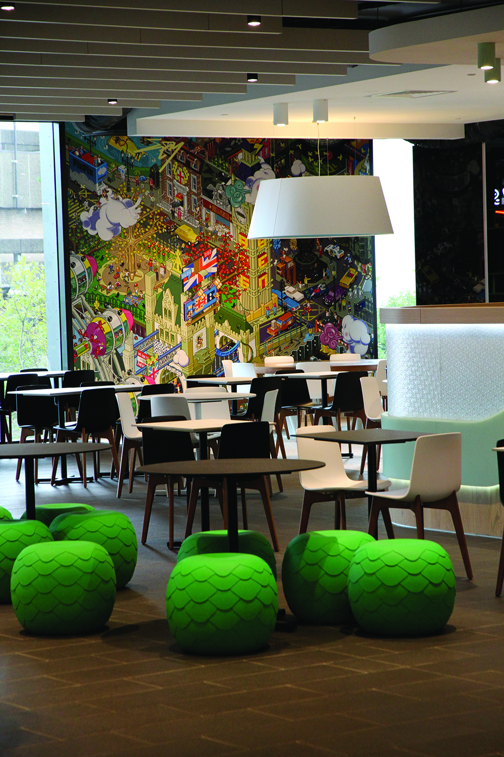
Design Clarity kept the plan deliberately minimal, neutral and constrained in material selection, allowing the street food retailers to pop with their own colour and movement. A black and white colour scheme predominates, injected with natural recycled timber and granite floor tiling throughout to add warmth and comfort. The strong focus on the living architecture and the internal herb troughs and large planters keep that link to the façade and the inner atrium below.
She cited one of the biggest challenges was finding a solution for the four wall sections that break up the span of glass (housing the living planting on the exterior).
“We went through so many options including light sculptures and street graffiti before finding the Eboy wall art which hits the right tone for the mall’s attitude,” she explained.
Central Kitchen’s layout also shows one of the most significant trends in food court design; one where the tenancies now live in the centre of the space and visitors mill around and between them, with a variety of seating types to suit diners’ moods and group sizes.
Colour is also used in exciting new ways, with recycled timber strip cladding and multi-coloured highlight slats as a way to differentiate different spaces — be it food, fashion or the global grocer. The food court of the future has arrived.


